


In this tutorial, we'll walk you through creating a simple login form using Tailwind CSS. Tailwind CSS is a utility-first CSS framework that makes it easy to style and design your web applications. We'll use the provided code as a starting point and then explain the key classes and concepts used in building this form.
Prerequisites
Before we begin, make sure you have the following:
Basic HTML knowledge.
A basic understanding of Tailwind CSS.
Let's get started!
Step 1: Setting Up the HTML Structure
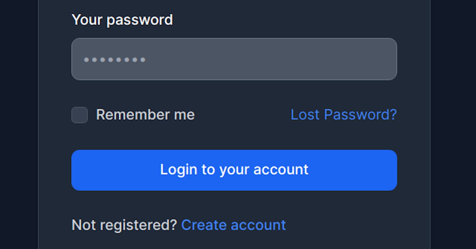
Start by creating an HTML structure for your login form. You can use the provided HTML code as a starting point. This code includes the necessary form elements such as email and password fields, a "Remember me" checkbox, and a submit button.
<div class="w-full max-w-sm p-4 bg-white border border-gray-200 rounded-lg shadow sm:p-6 md:p-8 dark:bg-gray-800 dark:border-gray-700">
    <form class="space-y-6" action="#">
        <h5 class="text-xl font-medium text-gray-900 dark:text-white">Sign in to our platform</h5>
        <!-- Email Field -->
        <div>
            <label for="email" class="block mb-2 text-sm font-medium text-gray-900 dark:text-white">Your email</label>
            <input type="email" name="email" id="email" class="bg-gray-50 border border-gray-300 text-gray-900 text-sm rounded-lg focus:ring-blue-500 focus:border-blue-500 block w-full p-2.5 dark:bg-gray-600 dark:border-gray-500 dark:placeholder-gray-400 dark:text-white" placeholder="name@company.com" required>
        </div>
        <!-- Password Field -->
        <div>
            <label for="password" class="block mb-2 text-sm font-medium text-gray-900 dark:text-white">Your password</label>
            <input type="password" name="password" id="password" placeholder="••••••••" class="bg-gray-50 border border-gray-300 text-gray-900 text-sm rounded-lg focus:ring-blue-500 focus:border-blue-500 block w-full p-2.5 dark:bg-gray-600 dark:border-gray-500 dark:placeholder-gray-400 dark:text-white" required>
        </div>
        <!-- Remember Me Checkbox -->
        <div class="flex items-start">
            <div class="flex items-start">
                <div class="flex items-center h-5">
                    <input id="remember" type="checkbox" value="" class="w-4 h-4 border border-gray-300 rounded bg-gray-50 focus:ring-3 focus:ring-blue-300 dark:bg-gray-700 dark:border-gray-600 dark:focus:ring-blue-600 dark:ring-offset-gray-800 dark:focus:ring-offset-gray-800" required>
                </div>
                <label for="remember" class="ml-2 text-sm font-medium text-gray-900 dark:text-gray-300">Remember me</label>
            </div>
            <a href="#" class="ml-auto text-sm text-blue-700 hover:underline dark:text-blue-500">Lost Password?</a>
        </div>
        <!-- Submit Button -->
        <button type="submit" class="w-full text-white bg-blue-700 hover:bg-blue-800 focus:ring-4 focus:outline-none focus:ring-blue-300 font-medium rounded-lg text-sm px-5 py-2.5 text-center dark:bg-blue-600 dark:hover:bg-blue-700 dark:focus:ring-blue-800">Login to your account</button>
        <!-- Registration Link -->
        <div class="text-sm font-medium text-gray-500 dark:text-gray-300">
            Not registered? <a href="#" class="text-blue-700 hover:underline dark:text-blue-500">Create an account</a>
        </div>
    </form>
</div>
Step 2: Tailwind CSS Classes Explanation
Let's break down some of the key Tailwind CSS classes used in this code:
w-full: Makes the element take up the full width of its container.max-w-sm: Sets a maximum width of 24rem (384px) for the container.p-4,sm:p-6,md:p-8: Adds padding to the container at different screen sizes.bg-white,dark:bg-gray-800: Sets the background color of the container and its dark mode equivalent.border,border-gray-200,dark:border-gray-700: Adds a border and its dark mode equivalent.rounded-lg: Rounds the corners of the container.shadow: Adds a shadow for a card-like effect.text-xl,font-medium: Defines the text size and style.text-gray-900,dark:text-white: Sets the text color and its dark mode equivalent.bg-gray-50,dark:bg-gray-600: Background color for input fields.focus:ring-...,focus:border-...: Styling for focus state on input fields.block: Makes elements display as block-level elements.rounded-lg: Rounds the corners of input fields.flex,items-start: Creates a flex layout for the "Remember me" section.ml-auto: Aligns the "Lost Password?" link to the right.text-blue-700,dark:text-blue-500: Sets the link color and its dark mode equivalent.
Conclusion
With this code and an understanding of the Tailwind CSS classes used, you've created a simple and stylish login form. Tailwind CSS allows you to easily build and customize UI components for your web projects with minimal effort. Feel free to further customize the form to match your project's design and functionality requirements. Happy coding!